DYSON UK - 2022
B2C Health, Fitness, Air Quality App & Smartwatch
Context
In 2022, after 6 months as a Product Designer at Dyson, Design Director Jon Marsh asked me to lead the creation and delivery of a new connected wearable product. The product vision and experience lacked clear ownership, and timelines were tight. I stepped in as design and experience lead for this 120+ people project and delivered a validated POC on time.
What is it?
⚠️ This product was initially planned for launch in 2024 but was ultimately cancelled after my departure and never released, so I cannot share full details.
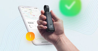
It was designed as an all-day Health, Fitness and Air Quality tracking product combining an Android and iOS mobile app with a screen-based IoT wearable running its own OS and micro-apps.
The wearable recorded metrics throughout the day and delivered notifications, insights and recommendations via the device or mobile app for deeper content.
What I did
New Product Discovery - 2mths
-
Led China and USA consumer and competitor research through 20+ interviews to define personas and market fit
-
Drove James Dyson and C-suite approval on a MoSCoW prioritised backlog of 50+ features across mobile and embedded
Delivery - 10mths
-
Lead squads of 7 designers, 10 mobile devs, 20 WearOS Watch devs and 3 Data Analysts
-
Development of new UX patterns for the bespoke Dyson watch OS and watch apps
-
Set-up of 15 bi-weekly quantitative & qualitative user validation cycles (usability & card-sorting interviews)
-
Cross-function management (marketing, legal, compliance) to keep the product focused on solving clear user needs amidst daily project shifts at multiple company-wide levels
OKRs
-
Delivery within tight schedule of mobile app FE (50 screens to set-up, view and edit health & workout data)
-
Delivery & real-life testing of a working smartwatch rig with Dyson WearOS & 6x Dyson watch apps
-
9.2/10 end usability testing score, great qualitative user feedback

Illustration-purpose only
120+
Ppl. Project
100+
Screens delivered
2
Dev teams
1y
Involvement
14
Designers
2024
Release
15+
Testing sessions
9.2/10
End test score
PHASE 1 - 2 MTHS
UNDERSTAND.
As a newly assigned Product Manager, I analysed multiple data sources to define target users, needs and product vision, ensuring strong market fit using EMUC methodology.
0. Product Definition & Origins
The 1st Dyson wearable connected product to launch is the Dyson Zone, an air purifier headphone that also monitors live pollution (cf. AQ value) and live-streams it to the Dyson mobile app. It launched on 02.2023.
I had the opportunity to work as a Product Manager on another IoT wearable device with this unique set of features:
-
An embedded screen with a dedicated OS & set of micro-apps
-
An all-new form factor/product category for Dyson
-
Tracks users' Health, Fitness & Air Quality metrics 'all day long'
-
Connected to a mobile companion app that showcases the measure data
-
High-end product
⚠️ To know before reading further
-
I cannot disclose specific product details such as form factor, features or competitors.
-
“Product” refers to both IoT device and mobile app as one experience.
-
“AQ” refers to Air Quality using WHO standards.
-
Dyson separates UX and UI roles across specialist teams.

1. What are we solving for which market?
"Empower citizens by making invisible local pollution visible"
The core value is combining AQ tracking with health and fitness data in a meaningful daily experience.
China was the primary market due to:
-
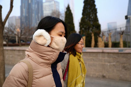
High pollution awareness with 2M deaths per year and a growing $1.5B to $2.5B market
-
Strong wearable adoption representing over 30% of global demand
-
High-end consumer demand in the luxury market
-
Strong Dyson brand trust in air quality technology
A key challenge remains shifting Dyson from home to wearable usage.

2. What are our direct & indirect competitors?
Group Commercial mapped competitors across China, USA and EU. I tested key products to build deep understanding.
User interviews and surveys provided feedback across:

Health-tracking devices
Direct & Indirect Competition.
Highly competitive across casual to elite users

Workout & Fitness apps
Potential Competition
Region-specific leaders like Nike, Strava and Keep

Air quality mobile apps
Indirect competition
Popular in China but increasingly integrated into OS ecosystems

Health-tracking apps
Direct Competition
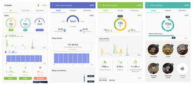
Dominated by Apple, Google and Samsung ecosystems

Air quality tracking devices
Indirect competition
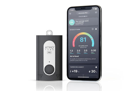
Growing global market with brands like Flow, TZOA and Atmotube
3. Who is this product for?
With Commercial and UX teams, we defined personas based on market targeting and real user needs. Personas include:

Persona 1: Active Citizens
Typical 30 to 45-year-old urban users who commute, go out and work out regularly. They seek better awareness of air quality in their daily environment.

Persona 3: Fitness Enthusiast
20M people in cities run regularly in China. These users are focused on staying fit and use technology to support their goals, with strong awareness of outdoor air quality.

Persona 5: Fashionista
Early adopters who would engage if the product becomes a trend. Design, personalisation and visual appeal are key to expressing identity and social status.

Persona 2: Health Sensitive
246M people in China are affected by AQ-related conditions such as allergies or asthma. These users are highly aware of their environment and look for effective ways to monitor and improve their health.

Persona 4: Family Carer
570M parents live in Chinese cities. There is a growing focus on protecting and educating children about air quality exposure.
4. Gather user needs & feedback
User research across China, USA and EU included:
-
Day-in-life video studies capturing real routines
-
Exploratory interviews on products and AQ awareness
-
Large-scale surveys for quantitative insights
I mapped user needs across daily journeys, creating a day-in-life matrix for each persona.

5. Technical software & design requirements
I had to understand the technical & design requirements of the different platforms the product would be working on. Here are some of the key highlights:
Platform 1: Embedded IoT OS
-
Battery life & Data ping: Optimised battery usage by limiting data sync
-
Form factor usability: Addressed new interaction challenges from the form factor
Platform 3: Cloud based services
-
Cloud-based services: Ensured reliable integration of Dyson and third-party data
-
Region-based: Handled regional differences, especially China vs global
Platform 2: IoS/Android Mobile app
-
Use & stream IoT data: Managed data sync between IoT, cloud and app
-
Android/IoS: Adapted to Android and iOS platform constraints
Phase deliverables
-
'Product vision requirements': Set the product target personas, technologies, objectives, and their associated requirements
-
'User research, feedback & insights': A sum-up of all the key outcomes from the various user testing
-
'Day in life user need matrix': User need breakdown for each Persona at each step of their day
Phase challenges
The project had pre-existing internal assumptions without user validation. I aligned stakeholders by introducing a structured, user-led design approach while incorporating their input.
PHASE 2 - 1 MTH
IDEATE.
Using research and strategy, I led two sprints of ideation to move from broad concepts to a structured feature set.
1. Find features & solutions for each user need
I worked with UX to translate user needs into feature ideas across daily contexts. This created a structured feature library used throughout the project.
2. Build the 1st feature matrix for each interface
Structured and prioritised features using MoSCoW across:
-
Mobile for deep data exploration
-
IoT for real-time insights and alerts
Initial feasibility checks removed unrealistic ideas.
3. Combine features into meaningful Groups
Once I had a well-structured and ranked feature list, the challenge was to find the best way of combining them into groups that would resonate with users:
-
On mobile: Groups would become 'tabs'
-
On the IoT device: Groups would become 'micro-apps'
This structured the product into six core groups, prioritised based on strategic value, with AQ as the primary differentiator.
Feature Group 1
AQ-related live & past features
Contains live AQ data, historic charts, notifications & other undisclosed features.
Feature Group 4
Undisclosed
Feature Group 2
Health-related features
Undisclosed
Feature Group 5
Undisclosed
Feature Group 3
Fitness related features
Undisclosed
Feature Group 6
Undisclosed
Phase deliverables
-
'Day in Life feature set': User need & associated feature breakdown for each Persona at each step of their day
-
'Feature set matrix': Detailed breakdown of all the features ideas, which data they require, and on which interface (mobile or IoT) they would be most relevant
-
'Feature Groups definition & Prioritization': VP approved list of feature group that would make up the micro-app set & mobile app main content
-
'Workload sizing estimate': High-level estimation of how many screens needed design for each micro-app & mobile
Phase challenges
Grouping features was complex due to the lack of benchmarks. Multiple structures were explored and validated during later iterations.
PHASE 3 - 1 MTH
PLAN & ORGANISE.
With scope defined, I created new processes to deliver 100+ screens in under 6 months.
1. Setting-up new AGILE workflow between teams
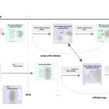
I introduced agile practices across teams and increased the design review cadence from once every two months to weekly sessions. I also defined a structured delivery flow across mobile and IoT to ensure consistency and speed.
Three design loops:
-
Concept validation
-
Usability validation
-
Look and feel validation
2. Setting-up AGILE tools
I implemented Jira and Confluence to improve collaboration and align design with development through 2-week sprints. I also established bi-weekly user testing combining in-person sessions and Userzoom.

JIRA Sprint, Backlog, roadmap
Jira was my go-to tool to oversee and assign tasks to the design delivery team and ensure perfect synchronisation with the Devs.
By working closely with the Product Owner, we worked in sync. with 2w sprint delivery, refining and grooming the backlog & user stories.
The AGILE rituals allowed amazing work efficiency & involvement from the entire design team.

Confluence Collaboration
It was used for cross-collaboration content & file-sharing. I built and managed the confluence tree structure, allowing designers to get instant feedback from reviews, engineers and managers without losing time in meetings.

Bi-weekly user testing
Together with the Design & Research/Insight team, we established a bi-weekly user testing process which redefined how Dyson trials and validates its product.
Each in-person user testing session was about 30/45m long, with 6 to 12 Participants.
This was done in parallel with quantitative testing using the online Userzoom platform.
Phase deliverables
-
'Project delivery flow-chart': Cross-organisation approved delivery processes
-
'Jira backlog & roadmap plan': An organised & prioritized backlog of Jira epics for each micro-app & mobile app tab
-
'Updated weekly Dyson Design Review process'
Phase challenges
Moving from a hardware waterfall model to agile software delivery required significant cultural and process change.
PHASE 4 - 8MTH
ITERATE.
With backlog and workflow in place, we executed three design cycles across all product areas while maintaining alignment with the product vision.
1st testing loop: Feature triage & Concept validation
We designed low fidelity wireframes, prioritised hypotheses using a risk versus test cost approach, and ran user testing and surveys. Once validated, I handed over backend requirements while design moved to the next phase.
Concept validation - Step 1
Design low-fid. wireframes
We created high-level wireframes for each micro-app and mobile tab, exploring which combinations of data and features delivered the most value to users.
Concept validation - Step 3
Run Concept Validation test
We ran bi-weekly in-person tests with 10 participants, including card sorting, tree testing and concept validation.
We also used Userzoom for quick quantitative validation and ran interviews in Shanghai with our target users.
Concept validation - Step 2
Identify & Rank the hypothesis
For each feature, we defined hypotheses and ranked them using a risk vs testing cost matrix to prioritise the most impactful tests.
Concept validation - Step 4
Build the back-end
Once validated, I handed over requirements and user stories for backend development, while the design team moved on to refining IA and UX.
2nd testing loop: Exp. refinement & Usability validation
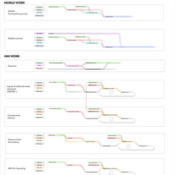
Now that each micro-apps and mobile tab had a validated feature set & wireframe structure, we had to refine the user experience by designing IA, UX patterns and running usability tests for each of the following:
-
Embedded 6xmicro-apps 30+ screens
-
Embedded IoT onboarding journey 10+ screens
-
Mobile app Connection journey 10+ screens
-
Mobile app screens 30+ screens
-
Notification systems
Find below the key steps we followed:
Usability validation - Step 1
Mockups, IA, UX Pattern
The design team created screens and defined the full IA. This was structured into a shared UX pattern library and guidelines to ensure consistent interactions across mobile and the embedded OS.
Usability validation - Step 3
Implement in-app UX pattern
Validated UX components were handed over to developers with annotated wireframes, enabling them to build the mobile app and embedded micro-app interfaces.
Usability validation - Step 2
Run Usability testing
We ran bi-weekly in-person usability tests with 10 participants to validate interactions across screens and features.
To support this, we built prototypes of the micro-apps and mobile screens using Figma and Android Studio.
3nd testing loop: Look&Feel dsg & Perception validation
The last main design step was for the UI, Motion & Copy team to make the UX wireframes look on-brand with Dyson. Here are the 4 areas that we had to deliver at that stage:
-
Embedded 6 micro-apps screens GUI kit
-
Mobile app screens GUI kit
-
Text copy for dozens of languages (feature/data/app on-brand names)
-
Lottie and real-time animations
Find below the key steps we followed:
Look&feel validation - Step 1
UI the UX patterns & screens
UI team created bespoke Dyson brand guidelines for the mobile app & IoT device (colour scheme, typography, iconography..). They applied it to the UX mockups and created a GUI kit based on the UX patterns component library.
Look&feel validation - Step 3
Update GUI & Devs implementation
Once validated, the dev teams would then implement the GUI kit on top of the previously built components, and release it back to us for the POC validation.
Look&feel validation - Step 2
Run user testing
New great visualization ideas came out of this UI process and had to be tested using the bi-weekly testing set-up in place for the project.
For example:
-
Which gauge design was the most accessible?
-
Which 'notification' colour scheme infers what purpose?
-
Which micro-app name resonates the most with users?
4.Full-product POC testing
Because we worked on each micro-app and mobile tab in parallel, we regularly received POC builds from developers to review and validate. These allowed us to test with real-time data, which was key to validating two things.
First, we refined the notification system to ensure users were not overwhelmed across apps. Second, we tested cross-platform navigation using real device software, which gave us a much more accurate experience than prototypes.
To support this, we ran outdoor testing to capture real pollution data, alongside internal guerrilla testing to gather quick feedback and iterate with developers.
My involvement ended after one year, when the project was successfully handed over to the Dyson team responsible for launch and ongoing development.

Phase deliverables
-
'Un-tested edge-cases': Exhaustive list of all un-tested hypotheses and edge-cases
-
'Design content for Dev': Tested and validated IAs, UX Patterns, GUI kit, screen designs released to the Devs
-
'Requirements for Dev': Requirements & user stories documentation for each feature/epic handed over to the devs
-
'Lottie & live animations': Lottie animation files & embedded code to implement within the screens UI (scrolling animations, icon animations..)
-
'Multi-language main Copy': Main brand-related features & micro-apps names, user tested and validated
-
'Project Risks': Exaustive list of all Project risks (list I managed and kept up-to-date throughout the all project)
Phase challenges
-
We lost our product vision focus by trying to follow user feedback too much. Patching a concept for weeks can make it loose its original purpose and meaning. My role was key to take a step back using all the data and cross-product knowledge to come up with a new solution that would fit the overall vision.
-
We couldn't legally provide the user with actions to take to protect his health (open the window..), which was a real need found in user testing. We had to find ways of making them come up with the actions by themselves


