LINKUP COACHING - 2020
B2B Business Coaching website & web app design
Context
As a Product Designer Consultant, I collaborated with the leading Business Coaching in France, Linkup, to re-design their brand image, Logo, website & web app learning platform, as part of a new digital transformation-led growth strategy.
What is it?
I designed a fully working and online coaching platform website, that allows businesses & individuals to browse for their perfect coaching course. It provides detailed breakdown of each course, with course planning, customer feedback, booking interface etc..
8-13K
Daily web traffic
+2.1%
Client retention
10
Page designed
+1.5%
Conversion rate
2
Dev teams
8/10
End usab. score
1
Wix testing site
2021
Launch
10
User interviews
PHASE 1 - 2 WEEKS
UNDERSTAND.
Before starting the design, I had to understand the context & market of my client business. To do so I mapped out the competition, their ideal customer profile & gathered insights from their Google Analytics.
1. Understand my client growth objectives with a Discovery Workshop
"Make Linkup a France market leader in remote business-focused Coaching sector"
I started the project by running a Discovery Workshop with the marketing, strategy & product team to understand their current market positioning and objectives, their target audience.
1. The strategy
Linkup strategy was to use the remote-working Covid trend to reinvent itself by offering updated remote-video-based Courses. By bringing their highly qualified and awarded in-person coaching expertise to this new high-demand market, they aimed for a short-term website client retention & conversion rate 1.5/2% % increase
To do so they wanted to:
-
Re-design the brand image & logo to fit the new company digital focus
-
Re-build their online website to put forward online-based Courses
-
Enhance their ongoing course web-apps usability & overall experience
2. Company target Persona

Persona 1: Business HR Leader
A typical main part of their audience, looking to train their teams. These users seek a structured, formal and professional-looking experience.

Persona 2: Private Professional
This audience would be looking on their own to learn new Business-related skills by getting a coaching session booked in. They would compare both B2B and B2C-focused platforms and would consider user-friendliness as a main selling point.
2. Existing platform experience review & interview
1. Usability Tests & Interviews
I had the opportunity to run x5 30m user interviews, gathering valuable feedback on how the platforms are being used by both parties:
-
3 interviews of ongoing Linkup clients
-
2 expert interviews of Linkup Coach to understand how they set up & use the web app & website to provide the Courses
2. Design & Experience review
-
Usability breaches: The overall current website contained some major usability breaches that the new one will have to fix
-
Design language & branding theme: The overall layout and brand colour schemes were not up to standards compared to other fully digital competitors
3. Google Analytic breakdown
-
I had access to the GA analytics for the current website, which allowed me to detect content value & retention trigger
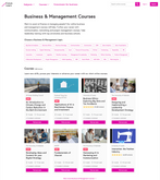
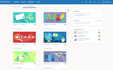
See below the original website design
3. Gather Market insights
1. Market Insights
The online coaching industry is a highly competitive market with dozens of alternatives in multiple broad or highly targeted coaching sectors. One of the key differentiating factors are the third-party state-level approval the training can get awarded with.
Here are some key insights showcasing the challenge of making an actor stand out in this crowded industry:
-
Worldwide: From 2022 to 2019, the coaching industry's annual revenue and income increased by 62%
-
In France: In 2022, the coaching industry value is estimated at 250M million euros
2. Competitor design & feature breakdown
I analysed Direct, Indirect and potential competitors to detect recurring features & and design language/user experience patterns within them.
4. Prioritization workshop
Together with the marketing, strategy & product team, we went through my findings and ranked the opportunities into an Impact vs Effort Matrix, and built 2 ranked groups:
- Day 1 Release: 'Must Do' & 'Should have' opportunities marked as Low-effort/High-impact
-
Day 2 Release: 'Could have' opportunities marked as High effort/Low impact
Phase deliverables
-
'Design Sprint backlog': A clear ranked list of enhancement priorities to explore for both the web app & the website
PHASE 4 - 8MTH
DESIGN SPRINT.
Once the Sprint backlog signed off, I started 2x 2w sprint cycles to ideate, design, validate & deliver the website & web-app content, working closely with 2 Dev teams (one for each platform).
1. Logo & Brand, Design language
After an extensive ideation phase, I submitted 15 new unique logos, which I then refined into the definitive choice.
It had to be clearly modern, digital and establish a new era for the Business identity. I used it as the driving guidelines for the rest of the design work.
2.1 Website ideation, design & validation
-
Landing page Design: I started the website design by focusing on the main landing page to settle the design language in collaboration with the Product and marketing teams
-
IA Design: I designed a high-level proposal of the IA structure to be tested later. However, the client had multiple legacy pages to re-use from the old website, making the IA very hard to optimise
-
Template Design: I then started the creation of the multiple 7+ bespoke pages and templates
-
Prototype: I built a working prototype of the website on Wix, showcasing detailed animation (hoovering, scrolling)
-
Validation: I ran 4x 30m usability testing with non-Linkup employees /users to avoid copy/wording bias in the findings
-
Result: I came up with an enhanced IA proposal and several design changes to enhance the overall usability of the website significantly
2.2 Collaboration with Devs
I collaborated with a 3rd party dev team to implement the website within a bespoke-made WordPress platform.
We followed AGILE Ceremonies, allowing me to catch up with them on a daily basis through the stand-ups, and do design content & guidelines hand-over throughout the 2 week sprints design phase, as well as the remaining 2months of dev work that followed.
2.3 End result live-website implementation
I hadn't had the opportunity to run user testing on the final website. It would have been interesting because the end result is slightly different than my original approved concepts. I would challenge:
-
The final shipped IA by running a Card-sorting test
-
Multiple accessibility errors that could be reviewed & enhanced in a future Day2 work-piece
3. 1 Web-app ideation, design & validation
-
Web app Design: I designed 2 variations of the web app, using 2 different design languages:
-
Inspiration from apps like 'Duolingo': Rounded corners, soft gradients, centred interface, bold typography
-
Inspiration from 'Linkedin' / 'Word' style: Square corners, flat panels, thinner typography, side menu panel
-
-
Prototype & Validation: I couldn't build a prototype on my own because of the complex click-drop interactions of the web app. Therefore I collaborated with the Devs and managed to run 2 usability tests with WIP version of the end design
-
Result: The end result is a validated user-friendly interface that pleased the client and had great feedback in the following months
3.2 Collaboration with Devs
I shared detailed animation (hoovering..), blur, shadow & gradient breakdown for the embedded dev team to built the product.
Phase deliverables
-
'Website assets': An SVG file containing several visual asset, typography file
-
'Website design guidelines': An extensive documentation of the website interactions (hoovering, scrolling..), as well as detailed colour, radius, gradient & shadow breakdown
-
'Web app assets'
-
'Web app design guidelines'
Phase challenges
The website IA was mainly managed by the Product team, and despite several user feedback concerns regarding its complexity, the client decided to keep it as they wanted. My role was then to re-design and enhance the accessibility of the header and drop-down menu to enhance the navigation as much as possible


